


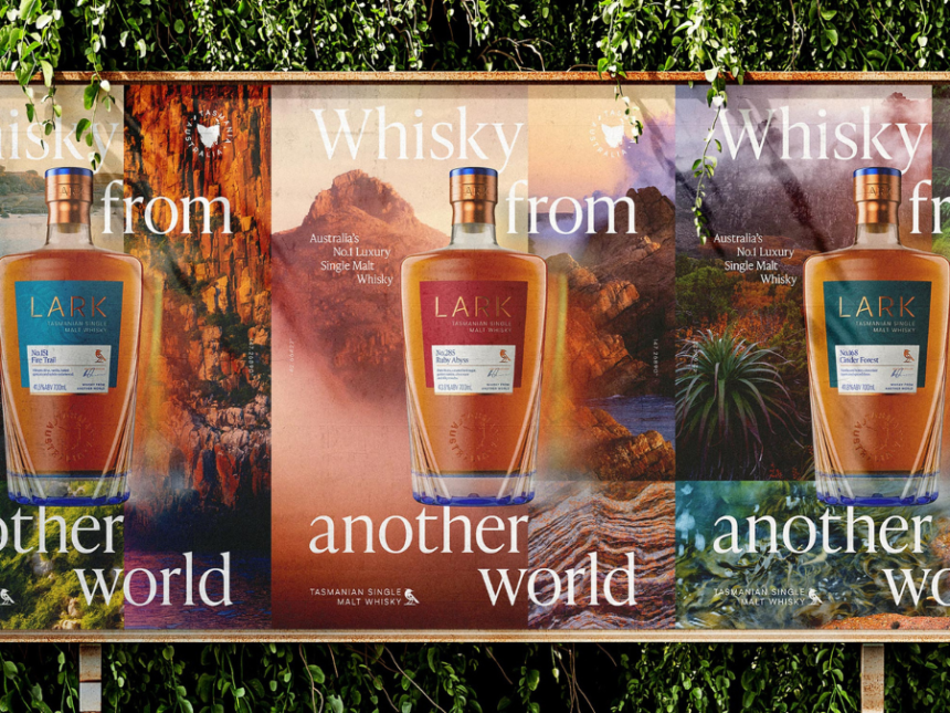
Lark Distilling Co is rolling out a new look and bottle for its namesake range of single malt whiskies that highlights the Tasmanian brand’s provenance.
The rebrand includes a new bottle shape – designed to emulate the shape of a lark – along with redrawn labels, an engraved stopper and a “semi-opaque blue coating” on the base. The new packaging also includes brightly coloured gift boxes featuring a lark (below).
The changes come as the company eyes export expansion, setting “a new luxury audience in Asia and Europe” as its target market. Global Drinks Intel has requested further details on Lark’s export plans and where the whisky is currently available.
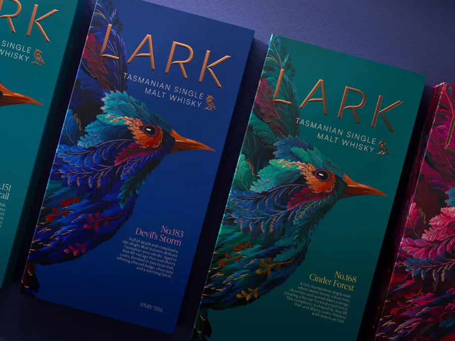
“This rebrand celebrates [our Tasmanian] roots while positioning us as a leader in luxury new-world whisky,” said Lark’s global brand & marketing director, Cleo Smeeth
Creative director David Palmer added: “Our strategy is built around the idea of a ‘mystical island’, perfectly encapsulating Tasmania’s position at the edge of the world. We wanted to evoke its culture, ethereal majesty and the very nature of the land and landscape that drives its people’s character, passions and quirks.
“The result is a brand world that truly makes it feel like Lark is a whisky from another world.”
The rebrand follows several executive appointments at the Australian distillery over the past year – including the hire of Brick Lane Brewing’s Paul Bowker as CFO last month and Four Pillars Gin founder Stuart Gregor as CEO in September.