

Almond-flavoured liqueur Disaronno has been given a packaging refresh by its owner.
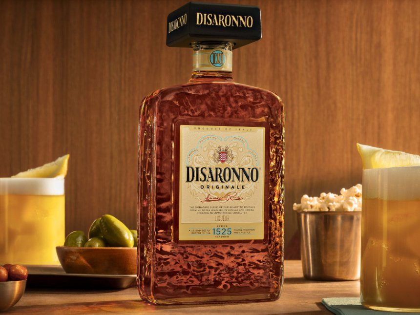
Five months on from launching a worldwide, spritz serve-themed marketing platform for the brand, Disaronno Group has unveiled a “taller, lighter” bottle for the amaretto this week. Rolling out to the Italian group’s domestic market this month, the pack will also go on sale in “key” international markets, including Belgium, Canada, Greece, the Netherlands, the UK and the US.
Among the updated elements are a redesigned square cap to appear “more modern … while preserving one of the brand’s most recognisable assets”, an embossed signature for the brand’s creator, Domenico Reina, and a ‘DD’ monogram to represent Reina and Disaronno.
Details about the weight change for the bottle were not disclosed.
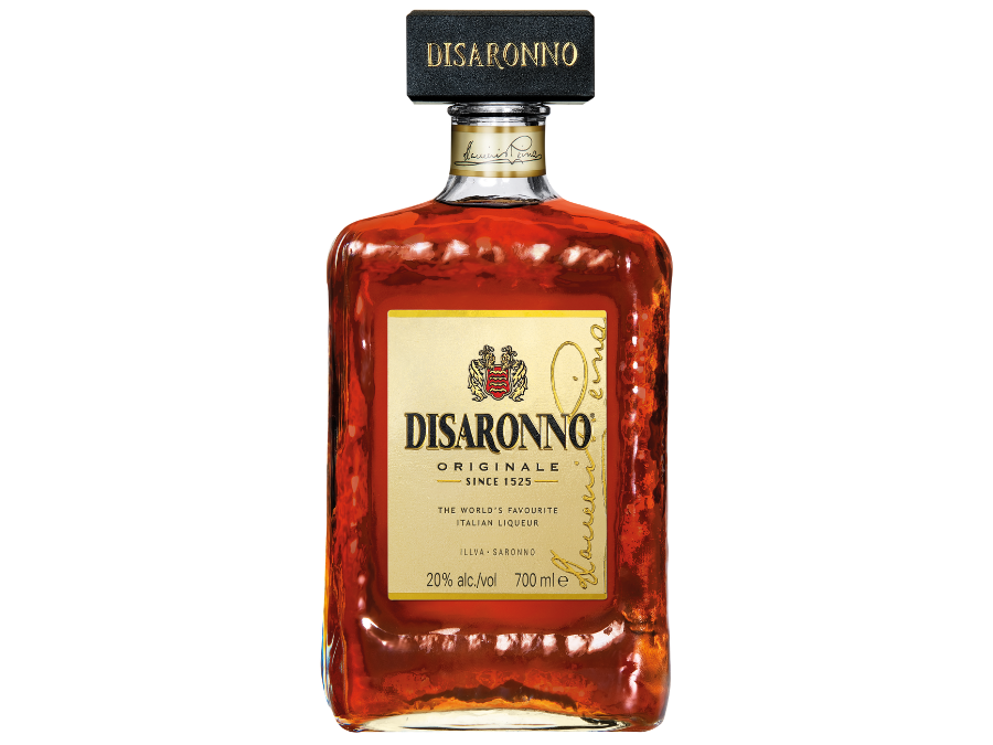
“Disaronno has always balanced timeless Italian craftsmanship with a spirit of modernity,” said the marketing director at Disaronno International UK, Peter Dries. “This new bottle identity reflects that evolution perfectly.
“While remaining instantly recognisable, the redesigned bottle brings a more contemporary and premium expression of the brand, while strengthening our appeal for today’s consumers.”
Speaking exclusively to Global Drinks Intel in June, group CEO Marco Ferrari hailed Disaronno as a brand that overpowers its category. “It’s impossible not to recognise Disaronno when you’re drinking it,” he said. “Having this identity is a point of strength right now.
“Today, our focus has clearly gone back to Disaronno as a core brand. There’s a great opportunity for a liquid like Disaronno to be relevant to current consumer trends in terms of lower alcohol, refreshment and simplicity.”