

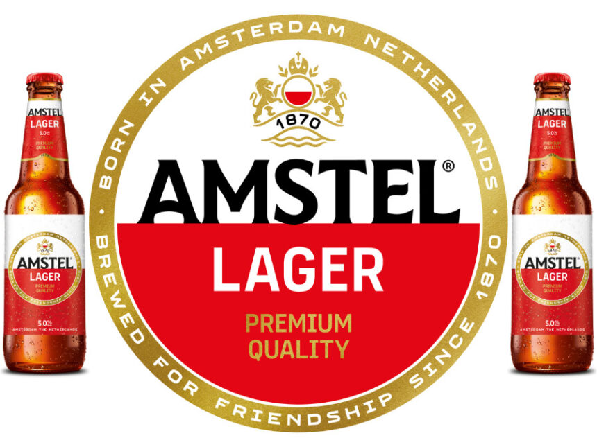
Heineken has released details of a packaging redesign for its international beer brand, Amstel.
The group has framed the update as “reflecting the brand’s Amsterdam roots and heritage, with a renewed focus on the golden circle”. Included in the move is a modernisation of the Amstel crest to include “greater clarity and distinction” for its circular border as well as a bespoke typeface for its lettering.
Founded in Amsterdam in 1870, the beer is named after the river that flows through the Netherlands’ capital.
“Our new visual identity celebrates Amstel’s unique Amsterdam heritage while bringing it into a contemporary context,” said the brand’s global marketing manager, Lizzy Wakkie van de Venn. “Amstel has always stood for quality, craftsmanship and connection. With this evolution, we’re staying true to what makes Amstel distinctive while ensuring it remains relevant and resonates with today’s consumers.”
Heineken’s global director & head of design, Ximena O’Reilly, added: “Our updated design continues to celebrate the heritage that has always defined Amstel. The changes to the typography, golden circle, crest and visual system are subtle but impactful.”
In April, Heineken released ‘Shot Without Permission’, a marketing activation for Amstel centred around photographs of unaware consumers visiting the on-premise who gave their permission for the photos to be used prior to publication.